Layout, Composition
-I started with a map page plan and then progressed to try to build it.
 |
| Plan of layout |
-The yellow square is where the schedule will go
-The blue square is where the artist info will go from the interactive map
 |
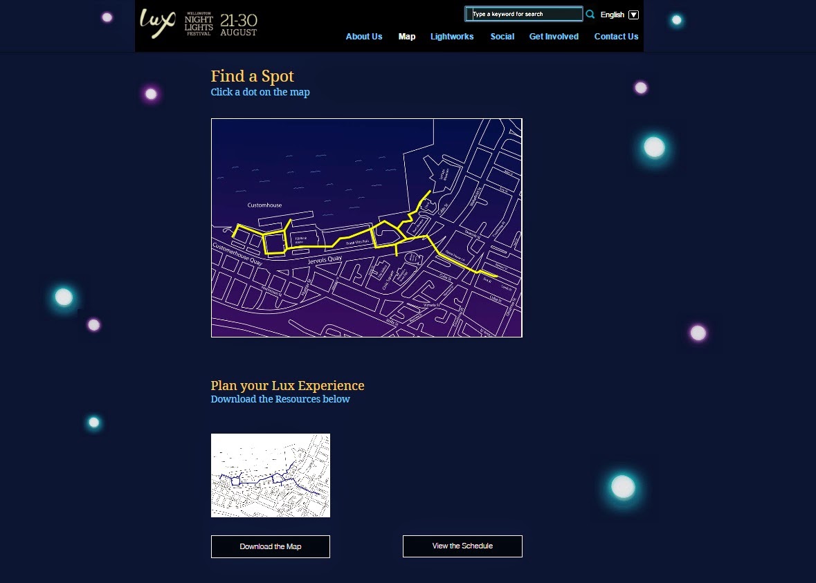
| Built into website layout so far (in progress) |
-Used the idea of the interactive map where when you click on a dot the information of the lightwork will appear and the user can choose whether to go to that page for more information. (Map still in progress so haven't added the dots yet).
-thought about the titles of the things on the page and thought about how this could be used to guide the user to use those functions.
Interactive Map function
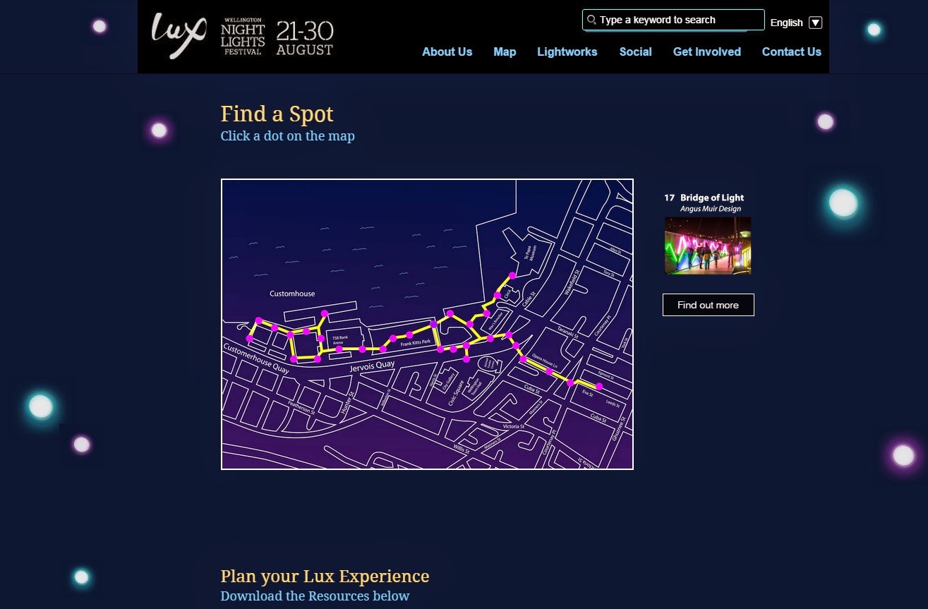
-When you click on the map the dot goes from purple to green
-Then the info from the button clicked appears to the right and the user can click find out more to find out more on that particular lightwork.
- Placed lights in specific places to guide the user down the page.
-Updated versions below
-Shot of initial page.
-Shot after the dot has been clicked
- When you hover over button it gets a yellow border and the font changes to yellow.
-Sarah


No comments:
Post a Comment