Screenshots of Developments
Homepage

-Changed the type alignment and logo
-Not sure how to fix "free entry" thing though with the text alignment.
Map page

-Made the dots on the map bigger.
-They now click to pop ups but only did two examples at the moment. (all dots left are bridge of light and all dots right are NZwarm)
-Type changed to be consistent with other pages.
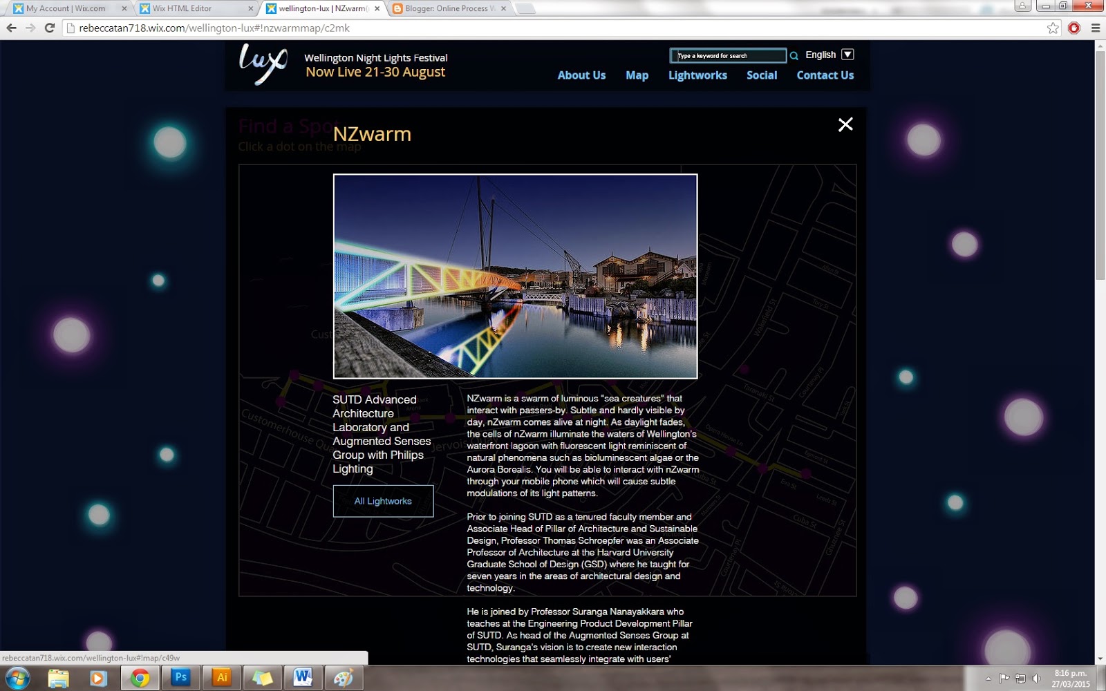
-Looks odd sitting in the box though any ideas on how to make it look better? There is a lot of text for this particular one.
-Maybe change view light works to view map since there is already a way to exit out of the box?

-Another iteration of pop up screen.
-Added buttons to go to artist website
-Did we want the title to be pink?
Lightworks

- Lightworks page so far ( only two at the moment).
-Still need to work on text alignment stuff

-Same thing with map page (Pop up window).
-Buttons clickable
Social Page

-Added a title to social media page and reduced size of comment box slightly.
About Us Page

-Tried out another layout for the about us page
-Moved stuff around and added buttons ( same buttons as other pages)
-Changed Font
-Forgot to change title colour to pink.
-Changed the look of the footer slightly to match the rest of the layout of the site.
-Also made it so the navigation bar moves down as you scroll so the user can use it anywhere on page.
Updated Home (Mobile)
-Only have done home at the moment

-Fixed colour of nav bar and alignment


-Still need to add the sponsors
-arrow takes user back to the top of the page
-Sarah
No comments:
Post a Comment