Saturday 28 March 2015

Website Lightworks page Developments

This page was the toughest to sort out according to our 2 column grid. We just kept it simple and made it quite similar to the original lux website page.


Need to make sure the pulsing lights go all the way down so it stays consistent. There is 16 waterfront, 12 Laneway and 2 secret locations. From scrolling down, I noticed the opacity of the navigation bar was too less because it was getting the tabs and info from the pictures confused. 

Mobile View

- Richie

Website pop up screen developments

Screenshots of pop up screen


Lightworks page (Pop up)
-added an arrow so you can go to the next pop up screen in waterfront category.
-changed the layout of text a little - not sure if its working yet, any ideas?
-added a google map- so user can find the spot.
-Also there is a link back to the map page just in case the user wants to download the map.

-Long text amounts seem to be a problem, this one the user has to scroll because it doesn't fit on the screen. 
-Not sure about layout, any ideas on how to improve it?


Map Page (Pop up)


- The text is long so tried splitting into two columns. Is this one better or just the one column better?

-the button turns white when you hover and click

-Also the text might be a bit squished, maybe?


-tried two column grid 


-Sarah

Friday 27 March 2015

Website further developments


Applying grids to make it easier for aligning our information and imagery. This will help make our pages more consistent. 


Flip the heading and sub-heading colour. Tried the usability test with a few people and most of them found that the neon pink was a bit too bright for such big text. The dark yellow seems to work better in my opinion. What do you guys think? Should we go for the yellow or do you guys have any other colours in mind? I feel that we should stick to our 3 colour palette though.


Still working on aligning things. The 'about us' page is a bit more harder to work with because of the schedule arrows. I guess we still have to play around with this page a bit more. 


We came across the issue with the pulsing lights. Since we are all working on different size screens, the lights does not show up on some of the computers. We need to test this on the uni computers next week to make sure they show up on a big screen. I added more lights so they can show up on smaller screens. 

-Rebecca

Website Developments- Chosen 5 pages and mobile home

Screenshots of Developments

Homepage

-Changed the type alignment and logo
-Not sure how to fix "free entry" thing though with the text alignment.

Map page

-Made the dots on the map bigger.
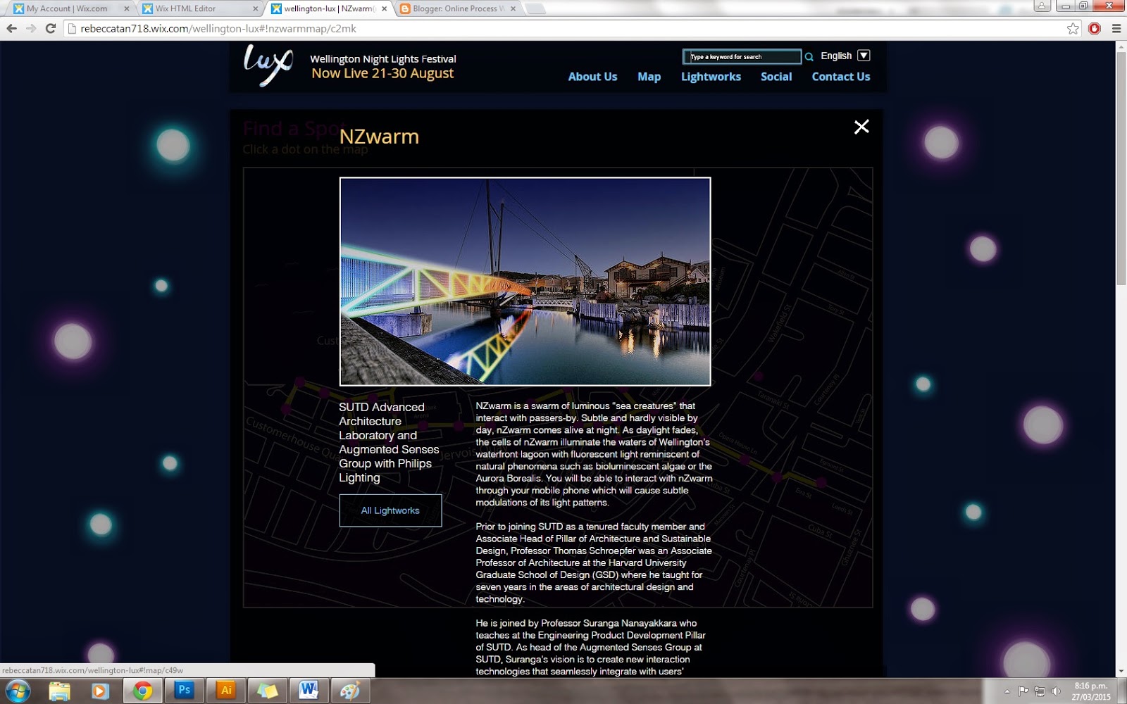
-They now click to pop ups but only did two examples at the moment. (all dots left are bridge of light and all dots right are NZwarm)
-Type changed to be consistent with other pages.


 -Pop up after clicking the dot. Also, if you click the x button or anywhere on the page, it goes back to the map view.

-Looks odd sitting in the box though any ideas on how to make it look better? There is a lot of text for this particular one.

-Maybe change view light works to view map since there is already a way to exit out of the box?

-Another iteration of pop up screen.
-Added buttons to go to artist website
-Did we want the title to be pink?

Lightworks

- Lightworks page so far ( only two at the moment).
-Still need to work on text alignment stuff

-Same thing with map page (Pop up window).
-Buttons clickable

Social Page

-Added a title to social media page and reduced size of comment box slightly.


About Us Page
-Tried out another layout for the about us page
-Moved stuff around and added buttons ( same buttons as other pages)
-Changed Font
-Forgot to change title colour to pink.


-Changed the look of the footer slightly to match the rest of the layout of the site.
-Also made it so the navigation bar moves down as you scroll so the user can use it anywhere on page.

Updated Home (Mobile)
-Only have done home at the moment

-Fixed colour of nav bar and alignment


-Still need to add the sponsors
-arrow takes user back to the top of the page


-Sarah

Thursday 26 March 2015

Presentation Practice

The words we based our website around are captivating, memorable and energy. We projected these elements through the use of colour, imagery and our subtle use of pulsing lights. -Rebecca

We wanted our website to be simplistic for our users yet still be intriguing. -Richie
We wanted to have snippets that had aspects of all our website. - Sarah

For us the content is more important than the aesthetic aspect

We tried making it user friendly as much as we could For example the language options that are available for tourists and having a search bar for people that are looking for something specific.

About Us

After reading what the whole event is about, we have gone ahead and added a schedule to make it easier for the user to know whats on and plan the event.
There are aspects that are similar to the homepage leading off to the map and the light works.

Map Page

Another aspect of it being captivating is the use of an interactive map. The user is able to pick a point on the map to have an overview on the location, its work and the artist. - Rebecca

We have given an opportunity to the user to print their own schedule and map so they can plan their own journey. They are reversed so don't worry ink will not be wasted. -Richie

The schedule is another support to plan the user's journey. It informs whats on each day and at what time. -Sarah

Lightworks

The light works are separated through the locations. Its quite similar to the original lux website layout.


Feedback

Fix heirachy,
Don't need the get involved
Keep it simple, have pop ups instead of having to change pages
The grid needs to be worked on
Keep leading and spacing same between header and body text

What to do Next

- Choose display font : Open Sans 30px
- Work on light works page
- Interactive map pop-up refine. Don't have it go off to another page
- text and grid alignment.
- Colour co-ordination: Headings= pink, subheadings= yellow and clickable= blue

-Rebecca, Saran & Richie

Homepage Development & Social Page

Social page


Home page


-Rebecca

Wednesday 25 March 2015

Mobile Layout Trial

Home and Map page

-Grid breaks into one column.

Home page


Map page


-Sarah

Map page developments

Developed Map/Schedule page


-made map larger
-will add a window to pop up after being clicked


-When a dot on the map is clicked it brings up a window of the event and a button that will take the user to the page with more information.

-When they click the x it will go back to the normal map.


-button turns white after hover
-added a schedule on page


- I thought we could make a schedule like this.
-It shows the current date but you can click to other dates to see what's on as well.


-Sarah